Political Polling Part 3: Turnout and Response Rate
This post is part of a series on political polling. To start at the beginning, click here. The code used to generate the charts in this post can be found here and here.
Previously in this series I discussed the concept of statistical sampling, and how even the perfectly constructed poll will produce a distribution of possible results due to the random chance of who happens to respond. Those are so-called “random errors”, and they’re relatively easy to predict and quantify. Now let’s talk about other kinds of errors, ones that pollsters spend the bulk of their time worrying about.
These errors come when an assumption that the pollster has made turns out to be wrong, usually because candidate preference ends up being correlated in an unexpected way1. Two major ways this can happen are with voter turnout and poll response rates
Voter Turnout
Voter turnout is the likelihood that a given person in a electorate will actually show up at the polls on the day of the election. Turnout can be intertwined with candidate preference through several demographic variables, a voter’s age being perhaps the most consistent correlation. Currently, in the US, older voters are both more likely to vote and more likely to vote Republican. A pollster ignores this fact at their peril.
To demonstrate, let’s set up another election, again with a million potential voters, but this time we’ll change both candidate preference and turnout likelihood by age:
| Age Group | Turnout Likelihood | Candidate Preference (Dem-Rep) |
|---|---|---|
| 18-30 | 30% | 80%-20% |
| 30-50 | 50% | 60%-40% |
| 50-65 | 60% | 40%-60% |
| 65+ | 90% | 25%-75% |
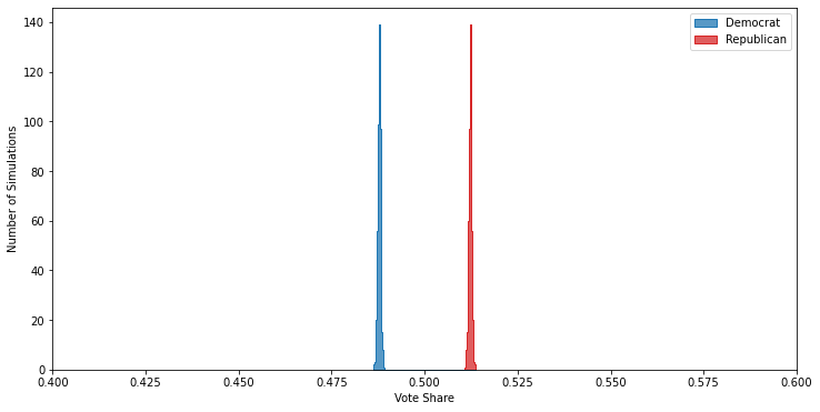
Powered by the high turnout in the 65+ age group, these demographics result in about a four point victory for the Republican candidate:
But, because of how many more potential voters are in the younger demographics — which skew heavily Democratic — naively polling any random thousand of them will make it look like a slam dunk victory for the Democrat:
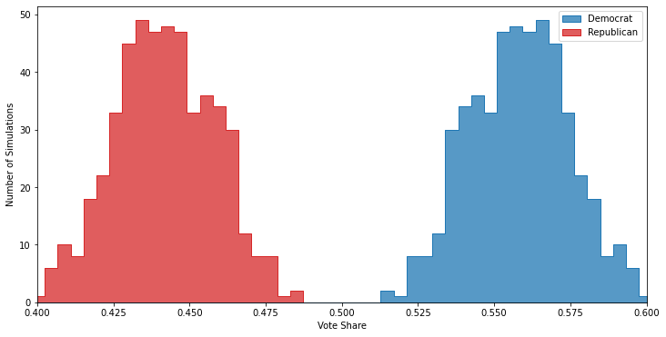
You can see that not only does the Democrat have a clear lead in the polls, but that lead is so large that not once in 500 polls is the Republican ahead. If you were to publish these results you’d wind up looking pretty stupid come election night.
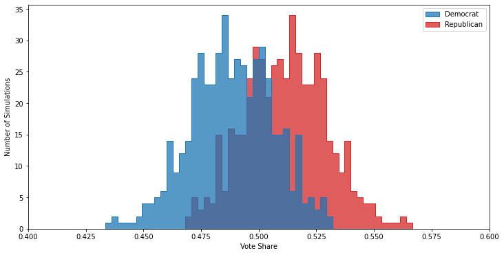
Fortunately, turnout is a systematic error that is relatively to control for2. The simplest way is to just ask respondents how likely they are to vote, and then build a mapping between responses (“absolutely certain”, “not likely at all”, etc) to probabilities. Then you can just weight each response by the turnout probability, and then your poll will be properly calibrated:
One of the really neat3 things about turnout modeling is that you can usually go back and check how good your model was. In many cases information about whether or not someone voted in an election is publicly available, at least to certain groups such as political campaigns. You can then join this data to your polling results, and determine whether or not the turnout likelihood you attributed to each respondent matched their actual behavior.
Unfortunately, a turnout model is not the only thing a pollster can get wrong.
Response Rates
In addition to turnout, a good pollster must also keep track of who is even responding to their calls4. In a twist that will surprise exactly no one, it turns out that not everyone is super jazzed to answer polls. Just like with turnout, if response rates are connected to candidate preference, your poll may be skewed.
Lets set up another electorate to demonstrate. We’ll use the same demographic groups as before, but this time we’ll keep the turnout likelihood at a flat 70% for every group and vary the response likelihood instead, assuming that older potential voters are more likely to pick up the phone5.
| Age Group | Response Likelihood | Candidate Preference (Dem-Rep) |
|---|---|---|
| 18-30 | 30% | 80%-20% |
| 30-50 | 50% | 60%-40% |
| 50-65 | 70% | 40%-60% |
| 65+ | 90% | 25%-75% |
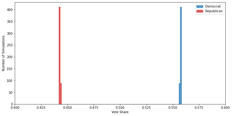
If you ignore demographics, your poll results will show an close race with the Republican candidate favored
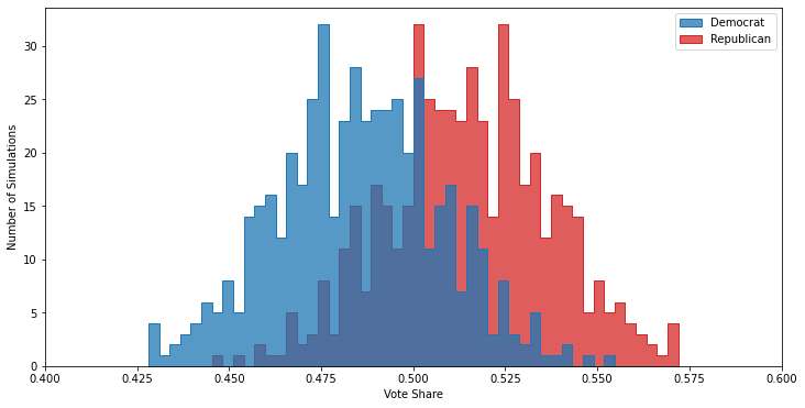
But, just like with the turnout example, this is wrong, although unlike in the turnout example here the Democrat runs away with the actual election:
Unlike with turnout, response rates are slightly trickier to correct for — it’s harder to adjust for anything when the problem is “couldn’t get any data at all”. The simplest way to approach the problem is to compare the number of responses you do get to the number of people you expect in the demographic, then either:
- adjust the weighting of the poll results by demographic group based on how over- or under-represented they are.
- keep polling people from the under-represented demographic groups, until the populations match what you expect.
Option 1 is cheaper since you don’t have to spend longer on the poll, but can lead to increased uncertainties because some of your demographic groups may only have a couple of respondents. Option 2 is the reverse, more expensive but you don’t have to worry about the undue influence of one or two respondents from a hard-to-poll demographic6. Since this is a simulation, I know that I don’t have to worry too much about sample size in my demographic groups. So using Option 1 is fine, and generates a much more accurate poll:
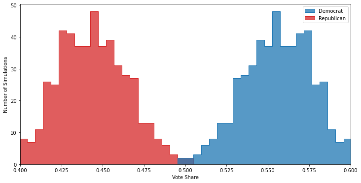
You can see that the polls now correctly predicts both that the Democrat is likely to win, but also are centered around the actual vote margins.
Don’t Get too Excited
Hopefully this post has provided a solid grounding on two of the major sources of bias a pollster has to be aware of, as well as the core tools pollsters have to mitigate these issues. But — and this is a large but — all of these strategies rely on one critical assumption: you correctly understand the demographics of the electorate. If you don’t know exactly what dimensions candidate support, turnout, and response rate are correlated along, you’ll have a hell of a time generating an accurate poll. I’ll talk about that scenario next time.
-
For instance, in 2016 candidate preference was unexpectedly correlated with education, contributing to the systematic shift between state polls and the final result. ↩
-
At least, easiest in my opinion. ↩
-
or terrifying, depending on your perspective. To me it’s a bit of both. ↩
-
Or answer the text message, or sign up for the online survey, etc. ↩
-
There are several plausible reasons why this could be true in the real world: retirees are more likely to be less busy; younger people may prefer to communicate by text rather than take phone calls; or seniors may be more likely to own a landline, which are easier to poll than cellphones because the area code directly maps to a physical location and calls are harder to screen. ↩
-
You can also combine both approaches: ensure you get a baseline number of respondents for each demographic group, then do the weighting. ↩